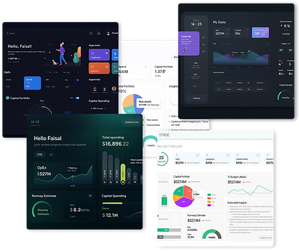
STRIDE
From Mismatched Reports to a Single Source of Executive Truth
In early 2024, I was brought in by North Power—a Tier‑1 power & utilities leader in the MENA region (name anonymized under NDA)—to solve a mission-critical reporting crisis.
The C-suite was overwhelmed, alignment fractured, and KPI decisions lagged weeks behind real-time performance.
My mandate? Design and scale STRIDE (Strategic Insights Dashboard for Executives)—a single source of real-time truth that could replace fragmented decks and drive confident action in under five seconds.

The Business Challenge
Every quarter, C-level leaders at a global enterprise were flooded with 7+ slide decks, each telling a different story.
-
KPI definitions varied wildly across business units.
-
Reports conflicted and clashed, delaying key decisions.
-
Analysts spent weeks creating decks—often obsolete by the time they were read.
The result? Decision latency, misalignment, and avoidable risk—at scale.
What they needed wasn’t “better charts.” They needed one trusted, real-time dashboard that showed what changed, why it mattered, and what to do next—in under 5 seconds.
My Role
As Lead experience Designer, I drove both the strategic framing and design execution:
-
Facilitated discovery with C-suite and data teams to define KPIs and friction points.
-
Repositioned design from reporting to decision-making.
-
Created a no-code dashboard system that enabled scale beyond the design team.
-
Institutionalized the first UX Center of Excellence, adopted by 12+ teams.
-
Mentored 2 junior designers; 1 promoted to mid-level within 6 months.

Strategic Design Decisions
This case study doesn’t aim to chronologically document every task. Instead, it showcases the three strengths I bring to high-impact UX leadership:
Strategic Product Leadership — reframing executive pain into a decision-making platform
Systems Thinking at Scale — building a modular, system adopted across 12+ projects
Cross-Functional Influence — aligning design, data, and leadership through familiar tools and co-creation
Disclaimer:To honor client confidentiality, all visuals in this case study are custom recreations—designed independently to reflect my hands-on craft capabilities. Names, UI designs, and branding have been anonymized. However, all strategy decisions, UX research insights, and outcomes described here are real and grounded in my direct leadership role.
Reframed the Problem
Rather than ask “how might we improve reports?”, I challenged execs with “What if your dashboards made decisions faster than team slides?”
Key Strategic Shifts
-
Redefined the problem space: From visualization to behavioral outcomes
-
Uncovered friction: Through shadowing, surveys, and journey-mapping
-
Designed for scale: Created a component system for real-time
-
Framed visual decisions around emotion: “Calm authority” became our guiding visual tone

Process & Key Actions


Understanding Executive Friction
Research goals
What We Set Out to Learn
Data Credibility:
What makes numbers feel trustworthy and decision‑ready?
Consumption Preferences:
Preferred cadence, format, and fidelity of insights.
Workflow Pain Points:
Where do manual processes add latency, confusion, or misalignment?
Mental Models:
How do executives conceptualise performance tracking and risk?
UI Clarity Drivers:
Which visual & interaction patterns lower cognitive load for non‑technical leaders?
Emotional Resonance:
How can visual language reflect leadership identity and authority?
Research Methodologies
Mixed‑Methods Approach
Contextual Inquiry Interviews
1‑on‑1, on‑site sessions capturing real workflows and language.
Quantitative Survey
31‑response instrument baselining trust and latency pain levels.
KPI‑Mapping Workshop
Cross‑functional alignment on metric definitions and data sources.
Contextual Shadowing
Observed 2 quarterly‑business‑review meetings to witness live decision dynamics.
Journey‑Mapping Workshop
Visualised end‑to‑end exec report ritual; exposed choke‑point at slide 14.
Affinity Clustering
Synthesised 27 pain points into Freshness, Consistency, Storytelling buckets.
Painpoints
Executive Pain Points: Data Overload, Zero Clarity
Every chart looks different. I don’t know which one to trust. And by the time we agree, the quarter’s already over.”
— VP, Strategy & Performance
Chaos, not clarity:
-
7–10 reports per quarter, each with conflicting KPI values and formats
-
No single source of truth—regions used their own success formulas
-
Manually assembled slide decks took 2+ weeks to produce, often outdated by review time
Cognitive overload:
-
Charts lacked context; leaders had to “connect the dots” under pressure
-
Filters, metrics, and visuals varied across BUs, increasing fatigue and interpretation riskKPI data lacked source transparency—even accurate numbers weren’t trusted
Brand inconsistency = Trust erosion:
-
Each report used different visual styles—execs questioned, “Is this even ours?”
-
This fragmented credibility and weakened cross-team alignment

Cross-Functional Involvement Strategy
“To speed up alignment and reduce friction, we embedded familiar tools like Excel and PowerPoint into our design process bringing the data team and CXOs directly into early prototyping.”
-
Instead of forcing every stakeholder into unfamiliar design tools, we met them where they already worked:
-
Excel for defining and validating KPI logic with analysts
-
PowerPoint for early layout mockups familiar to execs
-
Power BI + Figma for building real-data prototypes
-
This approach did more than save time—it made stakeholders feel like co-creators, not reviewers.

Action Feature and Goal

What you see is just one slice—beneath it lies a full service blueprint, broken down into actionable user stories and sprint-ready tasks.

Designing Visual Authority in a Data-Dense Space
Rapid Validation Through Agile Mock Dashboards
We started by aligning on what mattered most:
-
Listed every key feature the dashboard needed, based on CXO interviews, analyst workflows, and KPI use cases.
-
Created a visual mock UI, not to finalize design—but to test direction, language, and layout logic.
-
Used an agile validation loop: each component was dropped into a clickable “dummy dashboard” that simulated the real product—no backend needed.
This helped us:
-
Validate layout expectations before any data was wired
-
Align stakeholders on component hierarchy and data priority
-
Avoid over-designing speculative features

UI Alignment Without a Guide? We Led the Way.
The client had no unified UI guidelines only a basic brand presentation deck. Visual discipline across products was weak, and design preferences were unclear.
We ran a UI exploration workshop with multiple visual themes:
-
Each option came with design rationale, brand alignment logic, and usability pros/cons.
-
We framed the themes around values—clarity, calm, urgency, confidence—not just colors.
This gave the client language to articulate preferences and made visual decision-making fast and informed.
Result
By showing, not selling, we:
-
Helped the client decide UI direction in days
-
Avoided back-and-forth on aesthetics
-
Aligned quickly on a visual tone of “calm authority” that shaped the final design

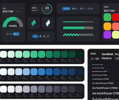
The Approach: Calm Over Clutter
With no visual guardrails, we defined one from scratch.
-
Dark grey background: Created a quiet canvas in a noisy data environment.
-
Green accents: Chosen not just for brand fit, but for what it meant—growth, balance, assurance.
-
Visual hierarchy: Let the metrics speak only when they needed to, reducing visual fatigue.
We tested both green and blue as positive cues—but found green struck the right balance between familiarity and psychological safety. In a dashboard where executives make calls with billions at stake, this color became more than aesthetic—it became a design signal for progress without panic.
We ran 4 rapid test loops with execs (CSO, CFO, COO) and analysts using an interactive Figma prototype over Microsoft Teams. Each round focused on 3 tasks:
-
Spot a bad KPI
-
Compare YoY
-
Find a pending approval
We captured success rate, time on task, wrong clicks, and NASA-TLX scores.
Every 24 hours, we logged issues in Jira, sprinted for 48 hours, and shipped improvements.
After each loop, the C-suite got a 10-min highlight reel + scorecard—watching anomaly detection drop from 41s → 19s in just 3 weeks.

Making Time Tangible: “Days Remaining” Indicator
During dashboard reviews, users repeatedly asked for the quarter end date and current date side by side. What they really wanted was clarity on how much time was left—without doing mental math.
Our Solution
We introduced a “Days Remaining” indicator and a visual progress bar showing quarter progression at a glance.
This small UX tweak eliminated the need for date calculations—and turned vague time pressure into clear, actionable urgency.

From Numbers to Signals: Delta-Based KPI Cards
Users kept asking, “Can you show the planned value?”We realized they were already comparing actuals to plan—mentally—every time.

Our Solution
We redesigned the KPI cards to visually show the delta between actual and planned values:
-
Color-coded indicators (green/up, red/down)
-
Clear percentage difference
-
Contextual labels to highlight deviation trends
This turned performance checks into instant insights—no mental math required.
Simplifying Filters to Reduce Cognitive Load
Executives were overwhelmed by a cluttered array of filters—timeframes, regions, KPI types—all stacked in dropdowns. It slowed exploration and decision-making.
Our Solution
We replaced the complex filter set with a simple toggle:
“This Quarter / YTD”
This minimalist control met 90% of user needs and dramatically reduced friction in dashboard interaction.

Calming the Noise: Priority-Based Alerts
All alerts looked and sounded the same—whether critical or routine. This created unnecessary stress and alert fatigue for users.

Our Solution
Two distinct sections in the notification center:
“Needs Your Attention” → High-priority, actionable items
“Good to Know” → Passive updates
Purposeful iconography to reflect intent (e.g., bell for alerts, chart for trends)
Time-stamped alerts with inline actions like “View” and “Drill Down” to reduce navigation friction
Visual hierarchy used layout and structure—not just color—to signal urgency
Sound cues redesigned:
High-priority alerts: firm, deliberate tone
Passive updates: soft, non-intrusive chime
Reduced ambient stress and helped users triage without needing to look
Surfacing Risk First: The Compliance Zone
Users instinctively scanned the dashboard for non-compliant metrics and wanted to know which business lines had the most issues—so they could act quickly.
Our Solution
-
Introduced a dedicated “Compliance Snapshot” section highlighting:
-
At-risk KPIs
-
Business units with the highest non-compliance counts
-
Severity-based sorting for fast triage
-
-
Designed the layout to elevate red zones by default, reducing time-to-action
User Request → Strategic Add:
-
Users wanted to initiate approvals from the dashboard itself
-
We added an “Approver Area” that:
-
Surfaces pending items
-
Connects to external workflow apps (e.g., SAP, ServiceNow, internal tools)
-
Enables contextual actions without breaking focus
-

Designed for Passive TV Viewing
While the dashboard was primarily built for desktop, we observed that many executives viewed it passively on large TV screens during review meetings. This insight led us to optimize the layout for distance readability and non-interactive consumption:


TVs had limited navigation—just a remote with directional buttons. So, the UI was designed to be simple, predictable, and easy to use without touch.
-
All critical metrics are surfaced upfront with large, high-contrast visuals, ensuring clarity from across the room.
-
The layout avoids deep hierarchies — making key trends and actions visible at a glance without scrolling or clicking.
-
We followed Android TV design principles like predictable visual flow (vertical for categories, horizontal within) and avoided placing content in hard-to-reach corners.
-
This made the dashboard equally effective whether viewed on a laptop or displayed on a conference room TV — turning data into a silent executive assistant in the background.
Platform-Specific Back Navigation
On TV, we removed all visual back buttons, relying on the remote's physical input.
On desktop, we retained a visible back control for clarity and ease of use.
This approach reduced clutter in the 10-foot UI while preserving expected interaction on personal devices.

TV View
Desktop View
Here we will add sample Prototype video and this text will be the discription


Reflection
What I’d repeat:
Meet users in their tools: Excel, PPT prototyping was the bridge to influence
Frame design as a business decision tool—not a UI project
What I’d evolve:
Push earlier for global design system investment to avoid visual debt
What’s next:
STRIDE UI kit is now being adapted for adjacent platforms (e.g., sustainability, finance risk)